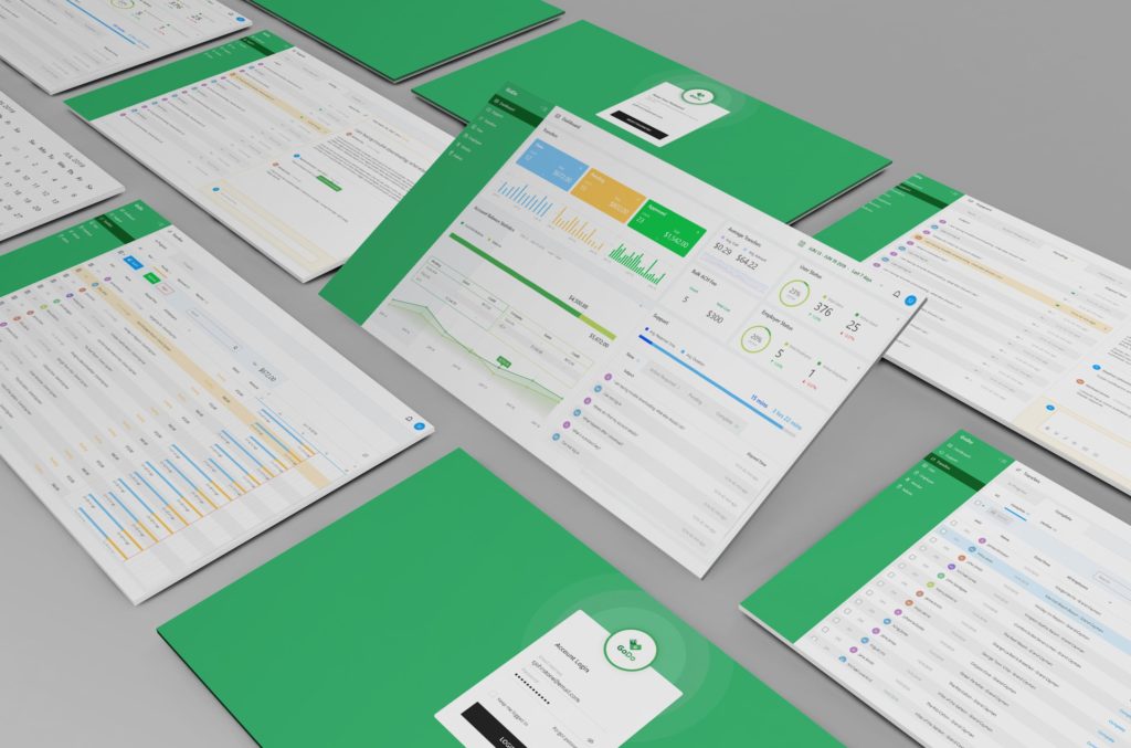
UI refers to User Interface – the all important connection between your app and the outside world. It is that series of screens, pages, and page objects, such as buttons and icons that a user sees on the device that is running your super cool app. If you want users to enjoy your app, you’d better design a great UI. Below we take a quick look at five seemingly basic, but significant steps to keep in mind while building out your super awesome UI.
1. Keep It Simple
The UI design is really a visual language for the application, and each UI element interprets the functionality of the app. Creating a complex layout, scattered, confused, jarring colors or styles will not provide the user with answers, but more questions. The goal is seamless interaction between the user and the app.
UI simplicity is on-trend. In a hectic world, users prefer minimal designs, sleek movements, and balance. Simplicity creates better flow. The app can have very complex functionalities, algorithms, AI, machine learning, and all the bells and whistles you want to deliver. Just keep the UI simple so that even the most sophisticated app will be easy to use. Clear visual representation of otherwise complicated data is necessary to give the user the ability to understand, analyze and interpret key data. A simple UI prevents confusion, error and ultimately productivity loss.
2. Create Consistency and Use Common Elements
Consistency throughout an application’s pages forms a pattern for the visual language that is being created with the UI. Once a user learns and experiences one part of the app, that knowledge or skill is transferred seamlessly to other portions and functionalities of the application. The user understands your language and knows how to communicate with the app. A light goes on in the user’s brain when he or she sees an element prompting an appropriate response.
The user will confidently apply that knowledge throughout the user experience causing the app to become easier and easier to use. Common elements will react the same, providing consistency and foreseeable results.
When the UI is intuitive, you reduce errors and increase productivity. As familiarity of the functionalities grow, the user feels more comfortable, puts his or her feet up, and is able to get things done quickly.
3. Be Purposeful in Page Layout
Place your elements where it is logical for them to belong. Consider the spatial relationships between items on the page, keeping in mind the effect visual processing has on the human brain. My Grandmother, a great cook, used to say, “please the eye, then the palate.” Same concept here. Create peace, balance and harmony between your white space, color, objects and text. Don’t clutter. Clutter equals confusion.
Structure the page based on importance. This means placing UI elements so that they draw the user toward what is most significant. Placement of the elements should say, look this way and pay attention.
Layout user options so choices are obvious, and features are easy to locate. Poor placement leads to wasted time searching. Don’t get too fancy, purposely use and place objects that people will see and recognize – hey, that’s an input button.
Careful placement of each UI element can help draw attention to the most important pieces of information, as well as aid scanning and readability. You want the user to actually consume and interact with the apps content and data.
4. Strategically Use Color and Texture
Start with common color collections, but then introduce variations such as saturation, contrast, and texture. This will give your page a feel, as well as a look.
Lighting and shading can be used to create a 3-D effect. The world isn’t flat, your app doesn’t need to be either. Panels, buttons and switches can appear capable of movement and dimension, making utility obvious. Don’t add too many colors, as you will destroy step one, keep it simple. Abstract art may look great on your wall, but not so much in an apps’ UI.
5. Use Typography to Create Hierarchy and Clarity
Typography is the art and technique of arranging type to make written language legible, readable and appealing when displayed. It also involves font, point size, line length, line spacing, and adjusting spaces between the letters. Style and appearance matters. Use fonts that work, not fonts that are hard to read. Again visual interest without distraction. Consider how you use the typeface, font sizes, and arrangement of the text to help increase scannability, legibility, and readability. Make it an easy read.
Technologies today are making it easier than ever before to take the steps necessary to create great UIs. One such example is Crowd Machine’s “Page Designer” that boasts a ‘drag and drop’ user interface design capability. Page Designer enables any ‘look and feel’ to be created for mobile and desktop devices. Additionally, rules allow the dynamic modification of page content and layout giving complete contextual control over the end user experience.
Page Designer is a part of Crowd Machine’s Crowd App Studio, a no-code app dev environment for the creation of intelligent microservices and complete apps. In this design environment, instead of code, a User Input “Activity” provides an interface to interact with the app. Defining an activity automatically generates a set of data objects that display as buttons and other page objects for you to customize and style.
Page Designer’s workspace consists of several features, each with its own function. The layout element provides options for different-sized screens (i.e. desktop, tablet, mobile). The design canvas in the center of the workspace represents an application’s page layout. Page objects are UI elements that can be added to the design canvas using drag and drop, in addition to those automatically generated, and aligned using the page grid and ruler. Once you drag a page object onto the canvas, the style tab is used to manage the page object’s properties, colors or display characteristic. You can also set up the page by selecting a theme from the drop-down menu, and corresponding page objects will display. Page designer has several page objects to select and style including: containers, headings, subheadings, body text, images, hyperlinks, tables, tabs, file uploads, drop-down menus, videos, as well as multiple buttons with various functions (cancel, click, checkbox, submit, delete). Data packages are added to the UI activities, after which the app designer can adjust its properties and style, or reuse it in other locations for consistency.
When you develop the greatest app ever, don’t fall down on designing the UI. Five steps is all it takes. Simple, consistent, purposeful, strategic & clear. Add a little tech on top, and your UI is sure to be great!